Designing Your Cover Page - The Rule of Thirds

Photographers know that one way to create an appealing photograph is to follow the "rule of thirds." The rule of thirds is simply breaking up the picture into nine equal parts using two vertical and two horizontal lines. The places where the lines meet are "focal points" and your most important elements should be placed along these lines.

To demonstrate this in photography, see the graphic below. One image naturally follows the rule of thirds and becomes even more visually appealing when it is cropped. The other image is not naturally set up to follow the grid, but after it is cropped, it does become a more interesting picture.

You can use this same principle in design. I use iWork's Pages (Mac) for most of my designs. It is very similar to Adobe's InDesign software, which I used in journalism. You can follow the rule of thirds in any design software, including Microsoft Word. However, using Pages and InDesign make it easier for you to create a grid that you can see, but will not print. In both programs, just place your cursor in the ruler, then hold it down and drag your cursor to the place you want the line. Once you start dragging, a blue line will appear.
Start with a blank document in Pages (or InDesign).

Place your cursor in the ruler, then click and drag it. A blue line will appear. Unclick when the line is where you want it.

To make the horizontal lines, drag from the top ruler.
The lines can always be adjusted by placing your cursor on them and moving them. To get rid of them, just move them right off the page, and they will disappear. (I do not know if Microsoft Word or Powerpoint have the design gridlines feature, but you can always download a template HERE; just be sure to delete it after you've designed your page and before you print, because that one will show up.)
Repeat this step until you have nine equal parts.
Notice that the four intersections will be places that the viewer's eye is drawn. This is where you want to place your dominant features or elements. Also, following the horizontal or vertical lines with a dominant feature (like the title or a large graphic) will be more eye-appealing.
Many people will be tempted to place a dominant image right in the center of the page. I have been guilty of that, as well. But the more stimulating designs will place a dominant image off-center, following one of the vertical or horizontal lines.
Below are examples of a cover page and a page from one of my Powerpoint presentations that demonstrate the rule of thirds. Notice that the cover page does not have any dynamic images, but because the title is placed on the upper horizontal line, it is more appealing. You can use lighting effects to also draw the viewer's eye to one of the focal points, as demonstrated in the presentation page example.

This does not mean that you should always follow the rule of thirds. But if you are struggling with design and want to try something that will catch the viewer's eye (perhaps make your pages more "pin-worthy" on Pinterest), try this method out and see if it works for you. Good luck!

You can download this tutorial FREE in my teacher store, which includes two gridline .png graphics and additional tips:


Pin It

It's The Lesson Cloud Dollar Days Back-to-School Sale AND a Giveaway!

The Dollar Days Sale & Giveaway sponsored by The Lesson Cloud!

The Lesson Cloud authors are presenting a big Dollar Days sale this week! PLUS, you can win a $75 gift card to Really Good Stuff in our Back-to-School Giveaway!
You can get great deals on so many teacherspayteachers lessons, activities, printables, and other teaching resources for just $1 or $2. But it's only happening Sunday, July 29th and Monday, July 30th, so you'll need to put those items on your wish list or add to your cart so you don't forget.

To see all the great resources that will be marked down and to enter the $75 giveaway gift card, go to 
There you can click on the grade-level resources that are marked at super discounts and enter our giveaway!

Clip Art:

Thanks to Hilary Lewis for designing the cute logo at the top!
Check out her blog {HERE}.


Pin It

Simple Solution for my External Hard Drive Problem...


Do you have a laptop? Do you also use an external hard drive or charge your phone on your laptop? If so, maybe you can relate to my problem that has been bugging me for over a year (and why I never thought of this solution sooner is beyond me).

You see, the only time I really use my laptop at a desk is at school. I mean, it's a laptop. It's meant to be portable! But when I have my external hard drive attached I tend to forget it's there. So, there have been numerous times I've gotten up from my relaxed position on the family room couch only to find that I, once again, accidentally unplugged the hard drive. It's especially frustrating when I'm in the middle of something new and I hadn't saved it.

For some time I've been looking for some sort of pocket to attach to my laptop case to hold it. Believe it or not, I could not find anything designed for an external hard drive (or my iPhone, either...which tends to have the same fate when it's attached & I forget about it). There had to be something. But, I had no such luck.

Then I realized that my hard drive came with a little carrying case. (I have a tendency to toss these things aside and instead cram all my devices into my school bag...) I found the case in a junk drawer and brainstormed ways I could attach it to my laptop.

It didn't take long to realize that Velcro(TM) would be the best way to secure it. I bought some industrial strength (no, the hard drive isn't heavy, but I wanted to guarantee it would never fall off) and easily stuck it on. The best part is that the little case can also hold my iPhone, as well, as it charges. (I just realized it can hold one of my little cameras, too.) Since the pocket has a zipper, I just keep the top open so the cord can stick out. I can easily carry it around the house without worrying about it slipping or sliding and falling. Seriously, this simple solution has made my life so much easier!

Here are some additional pictures and the how-to steps:
Supplies you will need: Velcro (I used industrial strength...it's not going anywhere!), scissors, laptop, external hard drive case.
The external hard drive case remains secure as the laptop is opened and closed.
The steps are simple: 
1. Cut the Velcro to the size of your case. 
2. Attach one piece to your case, the other to your laptop cover.
3. Stick the case on the Velcro, making sure the opening is "up" so the hard drive doesn't fall out.
Problem of the accidental detachment of external hard drive is SOLVED!
If your external hard drive doesn't come with a little case, you could probably make one yourself if you are crafty and can sew. Or maybe you could convince the family consumer science teacher (a.k.a. home ec) that this would be a great project for the sewing class! :) Either way, I do hope you find my simple tip helpful if you happen to have the same problem.


Pin It

Back-to-School Activities to Inspire Creativity

Back-to-School Activities to Inspire Creativity from http://www.traceeorman.com/2012/07/back-to-school-activities-to-inspire.html

 This summer seems to have flown by and I find myself debating different activities for back-to-school. No matter which ones I choose, I do love to inspire creativity in my students from the first day. It's important for them to see that I value and encourage creative thought. So here's a list of some great back-to-school activities you can share with your students.
Pin It

ICEBREAKERS

Icebreaker ideas for back to school. From: http://www.traceeorman.com/2012/07/back-to-school-activities-to-inspire.html

1. I just uploaded a new freebie today, which is based on an old favorite: Create a Caricature {South Park Style}. In the past I've had students create caricatures from the novel we were currently reading. But why not have them create little miniatures of themselves? Last year when we started our class blog, my students created their caricatures but most were unable to upload their pictures on Blogger because of some filters on our school servers. I created a work-around in a Google Doc that should allow my students to not only share their caricatures, but collaborate on some additional activities. This is also included in this back-to-school free download.

Icebreaker ideas for back to school. From: http://www.traceeorman.com/2012/07/back-to-school-activities-to-inspire.html
Pin It
The download has a student information planning guide so they can write information about themselves before creating their image. I always learn a lot about my students when I see their "mimi-me" creations. You can share them with parents on Open House night, as well.

Journalism connection: You can also have students create the caricatures for the yearbook or school newspaper. Have all the seniors create their own caricatures and use them for quotes or shout-outs throughout the book. The newspaper staff could have these figures as their head/mug shots rather than the standard staff picture.


And students aren't the only ones who should have fun creating caricatures: you can make a welcome back sign in your likeness, as well. Have fun with it!

Pin It

Icebreaker ideas for back to school. From: http://www.traceeorman.com/2012/07/back-to-school-activities-to-inspire.html

2. Another free activity is my Back-to-School Top 10 Lists. Have your students come up with positive reasons to be back in school. The lists my students have come up with over the years are hilarious. I included some samples in the download, along with additional ways you can incorporate the activity into your curriculum.


Icebreaker ideas for back to school. From: http://www.traceeorman.com/2012/07/back-to-school-activities-to-inspire.html

3. And who doesn't love BINGO? This is a variation from the traditional, and I certainly did not come up with the idea. I am sure I picked it up early in my teaching career somewhere, but I've included a couple of templates that I did create. And because each of us differ, I also included a blank template.

Pin It


The Collage Mobile - Icebreaker ideas for back to school. From: http://www.traceeorman.com/2012/07/back-to-school-activities-to-inspire.htmlThe Collage Mobile - Icebreaker ideas for back to school. From: http://www.traceeorman.com/2012/07/back-to-school-activities-to-inspire.htmlIcebreaker ideas for back to school. From: http://www.traceeorman.com/2012/07/back-to-school-activities-to-inspire.html

 4. Last year I blogged about my collage mobile activity, which actually takes longer than a traditional icebreaker and it is a priced item. But it is another great activity my students have enjoyed.


Create a Meme - Icebreaker ideas for back to school. From: http://www.traceeorman.com/2012/07/back-to-school-activities-to-inspire.html
 
5. Create a Meme: This is a new activity I uploaded this week to guide students to create their own meme. (It is priced.) The lesson goes over what a meme is, characteristics of memes, and loads of examples--most that are hilarious! It includes a 55-slide presentation and several student templates. I want teachers to be able to use my activities more than just once a year, so this has additional ways to incorporate the meme into your curriculum: research project, literature/history connection,  and so on. Updated: Here's an entire MEME Bundle that includes icebreakers, research project, presentations, and more!

Pin It

Use Tagxedo or Wordle - Icebreaker ideas for back to school. From: http://www.traceeorman.com/2012/07/back-to-school-activities-to-inspire.html

6. Welcome to Class Word Cloud:  In the spring I blogged about using your class list to make a nice end-of-the-year word cloud (On Wordle.net or Tagxedo.com). Though it was an idea for graduates, why not make a word cloud of your new group of students' names to welcome them to your room?


Use Tagxedo or Wordle - Icebreaker ideas for back to school. From: http://www.traceeorman.com/2012/07/back-to-school-activities-to-inspire.htmlUse Tagxedo or Wordle - Icebreaker ideas for back to school. From: http://www.traceeorman.com/2012/07/back-to-school-activities-to-inspire.html

7. "Me" Poem Word Cloud: In April 2011 I showed you how to make a character word cloud on my other blog, Hunger Games Lessons. In my poetry unit I have my students create "me" poems (or "I am", "bio" poems), then have them paste their poems into Wordle or Tagxedo. Instead of doing this during the poetry unit or for a character, you could have your students do this activity as a way to get to know one another. Have them print and hang in the room for their classmates to see.
Pin It

CLASSROOM RULES & PROCEDURES

See another post I have on this topic HERE.
8 Awesome Ideas for back to school. From: http://www.traceeorman.com/2012/07/back-to-school-activities-to-inspire.html
Pin It
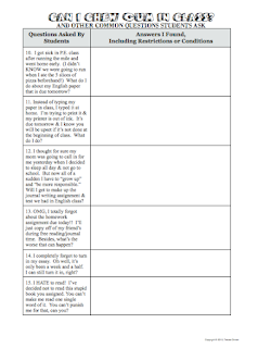
8. Can I Chew Gum in Class? How many times have you heard that question on the first day of school? I always hated going over the rules and procedures because it always took so long and students were zoned out. I would explain that cell phones were not allowed and a minute later a student would ask if she could have her cell phone. Ugh!
8 Awesome Ideas for back to school. From: http://www.traceeorman.com/2012/07/back-to-school-activities-to-inspire.html
This prompted me to create an activity that was student-led and more fun as we go over the rules and classroom procedures. I like to have students read the statements aloud, then they search the school handbook for the answers. If it's something not in the handbook, I'll have them guess the answer, or give it to them to record on the handout. (Writing it out helps them remember. Then they keep it in their class folder so if they forget and happen to ask if they can have gum, I'll tell them to refer to their notes from the first day.) I always have plenty of volunteers to read the statements because I wrote them in "teenage" lingo--basically quoting questions my own students have asked year after year. However, it is editable so you can customize it for your classroom and school. And because I am always curious about how others are running their classrooms (am I too strict? too lax?), I included the answers I give my students. If you are a first-year middle- or high-school teacher, this will be very helpful.

9. Meme posters: Use memes to convey your class rules and procedures! Students LOVE these!

Use memes to go over class rules and procedures.

Teacher and student meme posters bundle.


I hope you find some useful activities for your first week of school. And make sure you enjoy the rest of your summer! :)

Check out more activities and ideas in my teacher store on Teachers Pay Teachers:

Pin It

Cute School Supplies Clip Art for Commercial Use

 I started creating these little "props" to use in my own lessons almost a year ago. As you probably know, I am pretty slow to post new products because it does take me a while to complete them. So it was such a relief to finally finish this package of school-related graphics yesterday. It includes over 95 PNG files that can be used commercially and/or for educational and personal use. My only requirement is a link back to my website or my teacher store.

One of the great things about these school supplies is that they can be layered with your favorite characters, as demonstrated below...
...or used on their own.
SIDE NOTE: I have had many questions about "layering" and the difference between JPG (or jpeg) files and PNG files. If you scroll down to the bottom, I included a very brief explanation. :)

My school supplies bundle contains many images in full color as well as line-art, so you can have students color the graphics (plus it saves on ink). Below, I combined the iPad-like tablet with my Handwriting Lines clip art, which comes in a variety of lengths and widths and is so easy to work with when creating products for primary students.

I decided to create my people figures separate from the supplies because I think it adds versatility for the user of the graphics. Have you ever wanted to use an image of a group of items, but one item just didn't fit with what you were making? Now you can make your own groupings, like I did with these sports balls and equipment. (Plus, some teachers may not want the cute little people. But the "props" are still "cool" enough to use with older students.)

Another advantage is with the overall design of your product or scrapbook page. Sometimes you have to tweak items to make them work. Above, I was able to position the golf club and golf ball to suit my needs. Below, the book and ruler in the image were both rotated to fit in the girl's hands perfectly. 

PNG vs. JPG files...
In case I have completely confused you with all this talk about "layering" images, it helps to know a little about the types of images if you plan to design things digitally.  So here's a very condensed explanation to the difference between PNG files and JPG files:

The PNG format makes it possible to knock-out the background, so your images easily layer on top of one another without the white (or whatever color) background overlapping. You cannot layer JPG (or jpeg) files like this. 

To demonstrate, see the image below. The girl on the left is a JPG file and the girl on the right in a PNG file. When each is placed on a purplish background, the JPG file will maintain its white background. The PNG's is knocked-out, allowing you to place additional PNG files on top of it. 
Another difference between the two is PNG files never lose their quality.  JPGs, however, will begin to degrade every time you open them, so over time the quality of the image will not be as sharp. Because of this, PNG files are much larger than JPGs, making JPGs (and GIFs) more ideal for web browsing because they load faster. This was something I learned while teaching journalism and advising yearbook and newspaper (because digital photography was not around when I was in college...yes, I'm that old). I picked up a lot during those years, and continue to learn as technology keeps advancing. That's an advantage to teaching: it forces us to keep learning and passing along that knowledge. Of course, I learn just as much from my students as they learn from me.

If you need help working with images in Microsoft Word (which, in my opinion, is one of the worst programs for design/working with images), you can download this free tutorial. People who use Microsoft and do a lot of designing would probably be better off using Powerpoint or Publisher. 

Since I am a Mac girl, I use the iWork applications (Pages, Keynote) and Adobe's Creative Suites apps: Photoshop and InDesign. Pages is much like InDesign, but much easier, so I have actually converted to using Pages more. If you use a Mac, I highly recommend it!

Back to the clip art...
All of my images are PNG files. On occasion I will include additional JPG files, but I will always include the PNG files. You can find all of my packages in the clip art department of my teacher store
Or just click on my button below.

Or if you are looking for specific packages, here are some links to my recent ones:


 I appreciate you stopping by my blog! This post was long overdue, so I apologize for its length. As thanks for reading through it, you can click {HERE} to get some limited-time freebies from some of my new packages. Hurry, though. They will only be available for a limited time. Please read the terms of use if using these for commercial products. Also, they cannot be resold in a clip art package, or altered and resold as clip art. If used in a free product, it must be secured in a PDF document. No exceptions. Thank you!

Pin It